ACCESSIBUILD,
ACCESSIBUILD,

2021
Adobe Illustrator, Adobe Photoshop

Color Palette
Black, purple, & orange
Font
Divenire
Icons
Shapes, modify, community
WHY THIS CAMPAIGN?
AccessiBuild provides accessibility information to active customers in an encouraging environment with an approachable voice. Helping them feel motivated and be advocates for change.
MAIN CHALLENGES
Creating icons that work well with the logo, yet are different enough from the logo, in order to make a cohesive and clear campaign.

Inspiration & Process
INSPIRATION
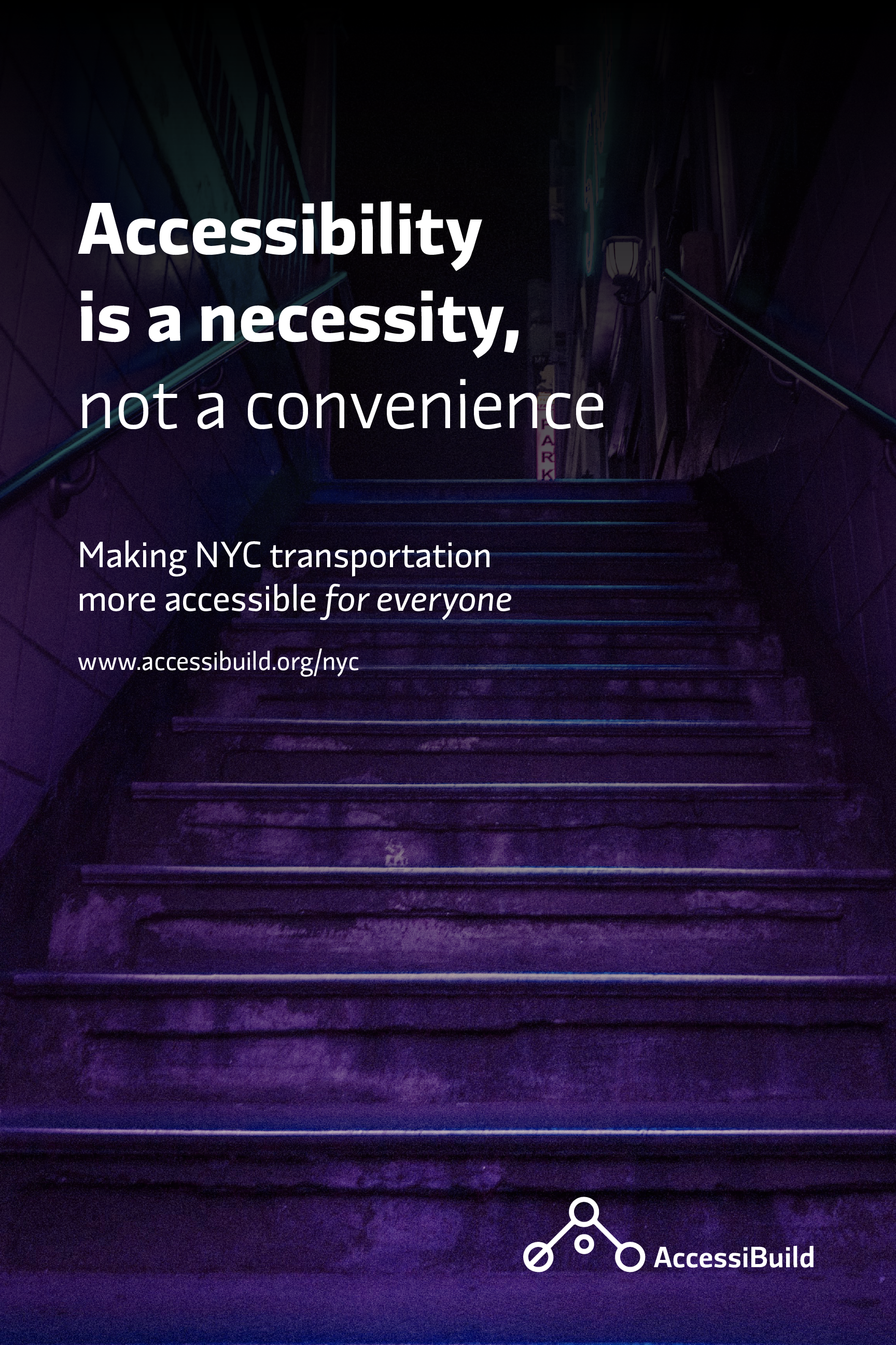
After researching wheelchair accessibility in the United States, I focused on New York City. While NYC has a lot of public transportation, there are many changes that need to be made in order to be more wheelchair accessible. These changes will make commuting easier, more time-efficient, and safer for wheelchair users. Making public transportation wheelchair accessible is a necessity that benefits everyone in the public.
PROCESS
I went through multiple rounds of logo designs and ultimately decided on using lines and circles to form it. The final logo is an abstract letter A that also represents subway stops on a map. By shifting from a circle with a line through it to circles that do not, it shows the idea of progress and change. The circle in the center of the logo helps create the letter A as well as show that the user and their experiences are the main priority, so that disabled voices will be amplified.
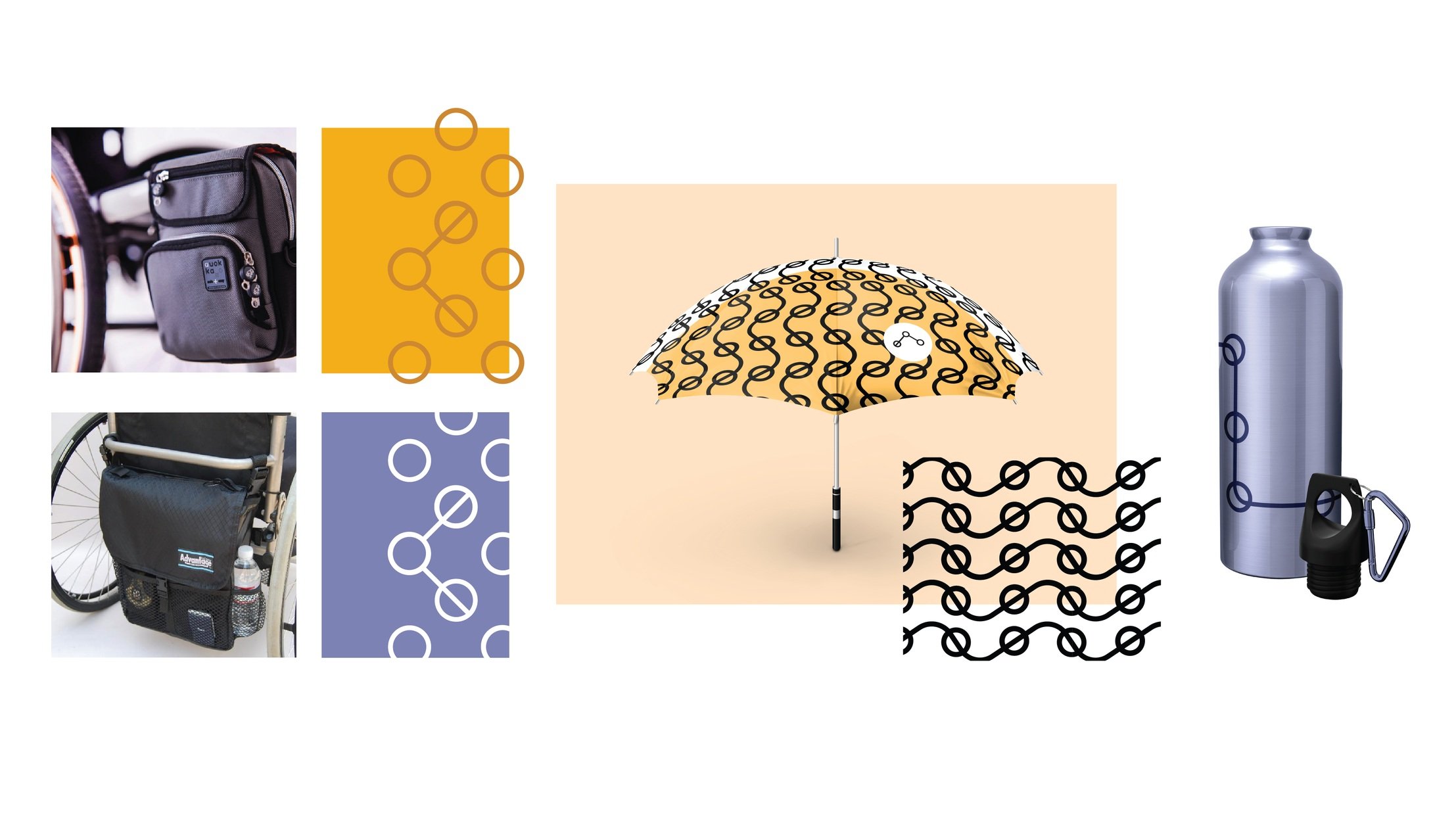
The branding was then applied to posters, Instagram posts, water bottles, wheelchair bags, umbrellas, and a website page.

PERSONAS
People who are in their 20s, use public transportation (and want to use it more if there are improvements in accessibility), and live in New York City.

Final Campaign & Designs
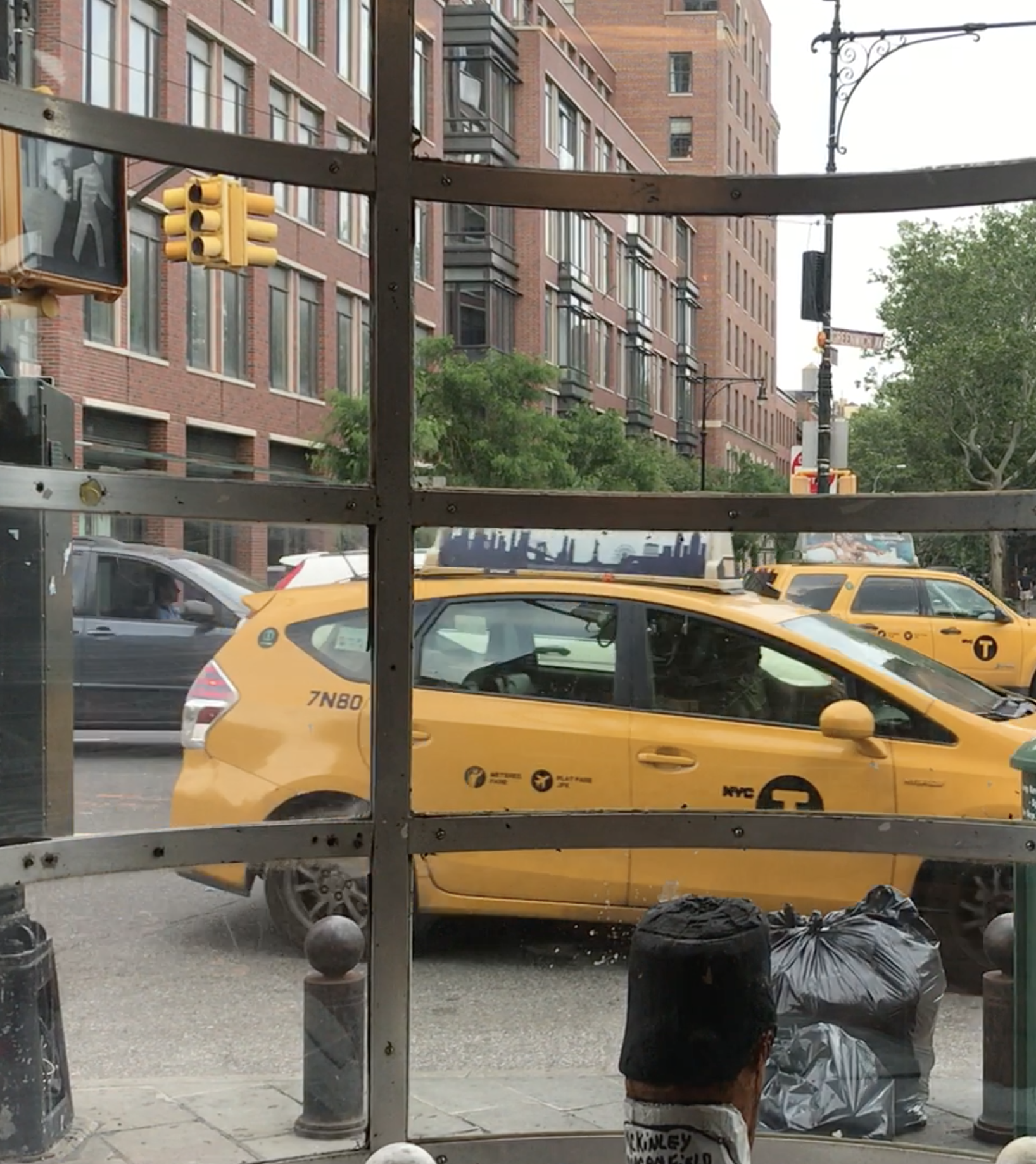
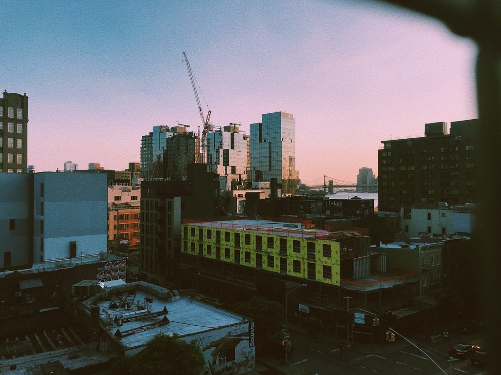
All photographs are my own


Icons for various words and patterns related to those shapes, all based on the logo design.
Photo Credit: Unsplash: Valeriia Neganova / Photo editing: Ada Parnanen


