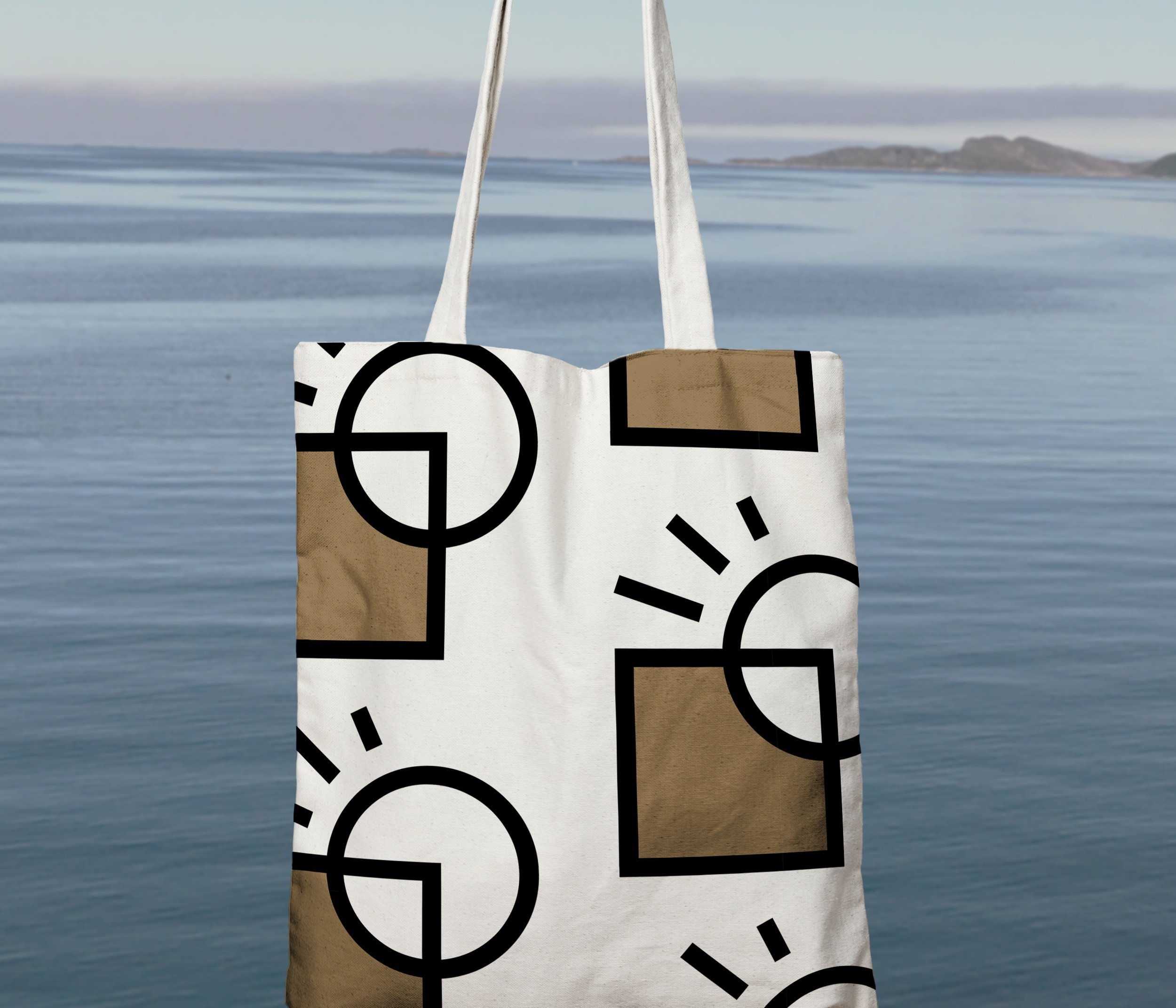
DESIGN/ARCHITECTURE,
DESIGN/ARCHITECTURE,
2021
Adobe Illustrator, Adobe Photoshop
Color Palette
Brown, gray, blue, green, & white
Font
Azo Sans (Primary), Zilla Slab (Secondary)
Icons
Process, sustainability, rocks, etc.
ABOUT
An architecture company that aims to use sustainable materials in California, with a Nordic influence in design. An emphasis on indoor-outdoor living to make the most of California weather. Simplistic design for the branding to match the Nordic influence in architecture.
MAIN CHALLENGES
Finding the balance between organic and geometric shapes, along with white space and text. Creating more modern and simplistic texture by using illustrations such as the rocks.
Inspiration & Process
INSPIRATION
The branding style combines both modern and organic elements to create a Nordic-influenced feel. With a focus on white space and neutral colors, mixed with hand-drawn illustrations, the website is professional yet approachable.
PROCESS
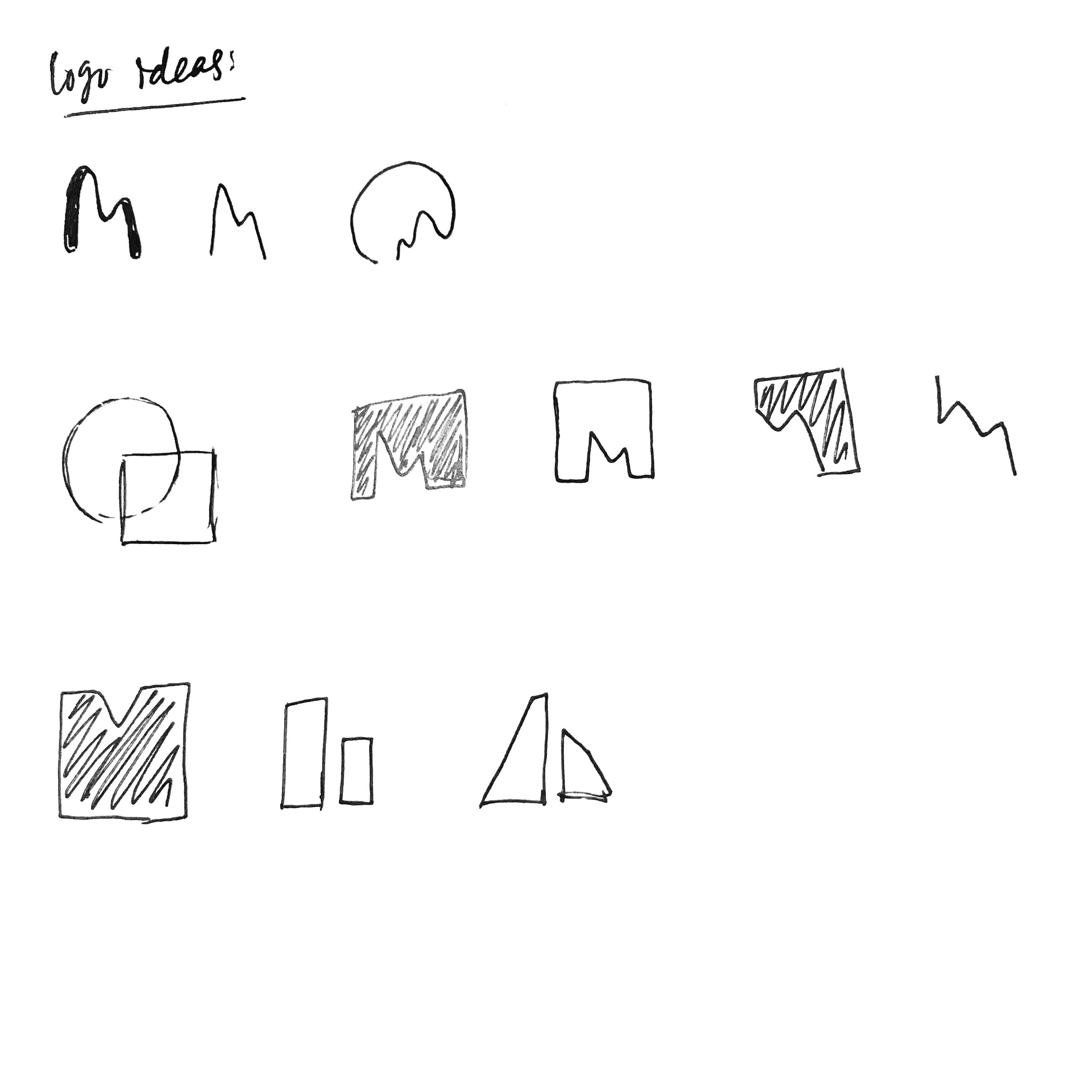
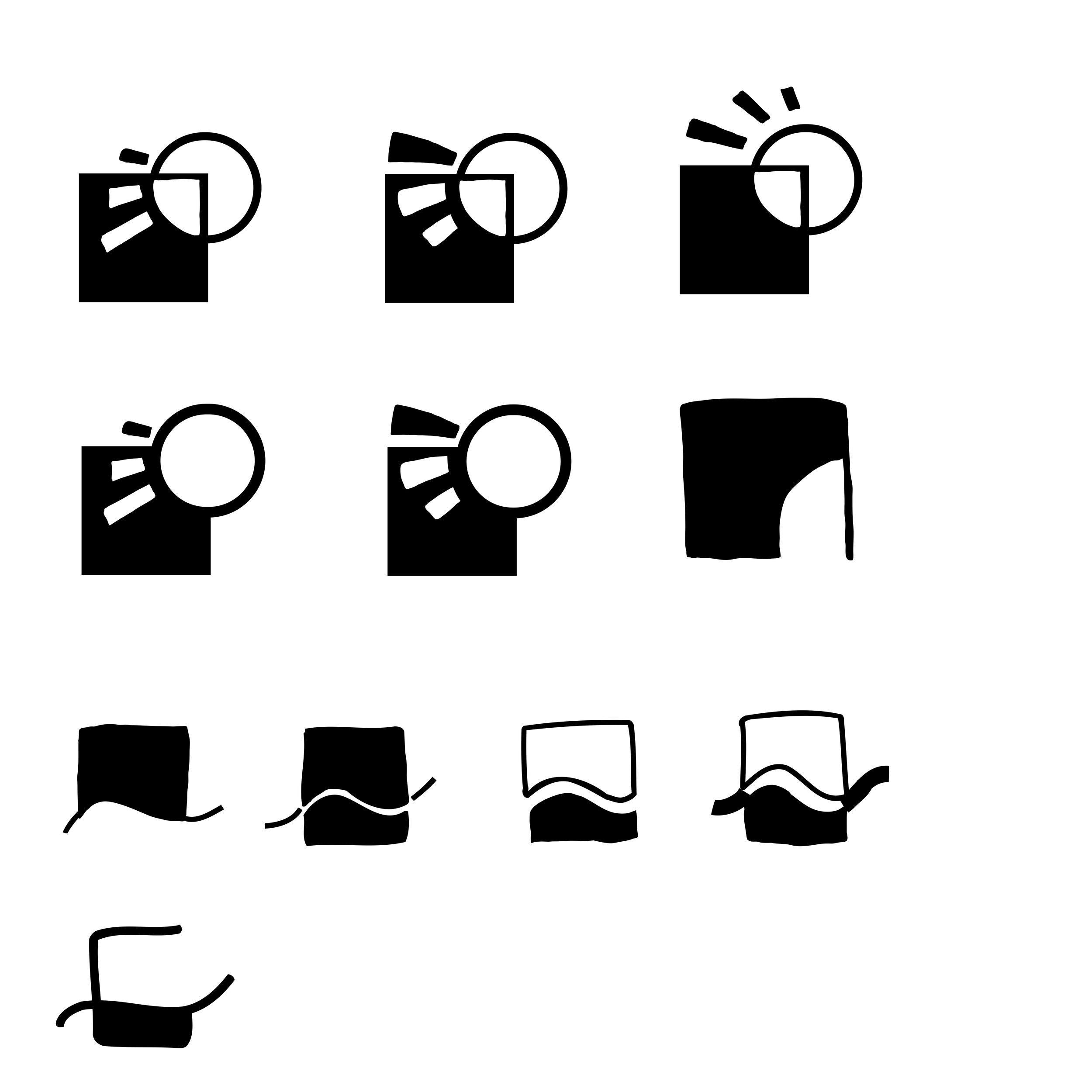
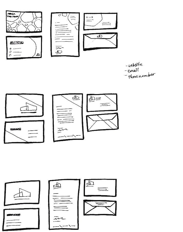
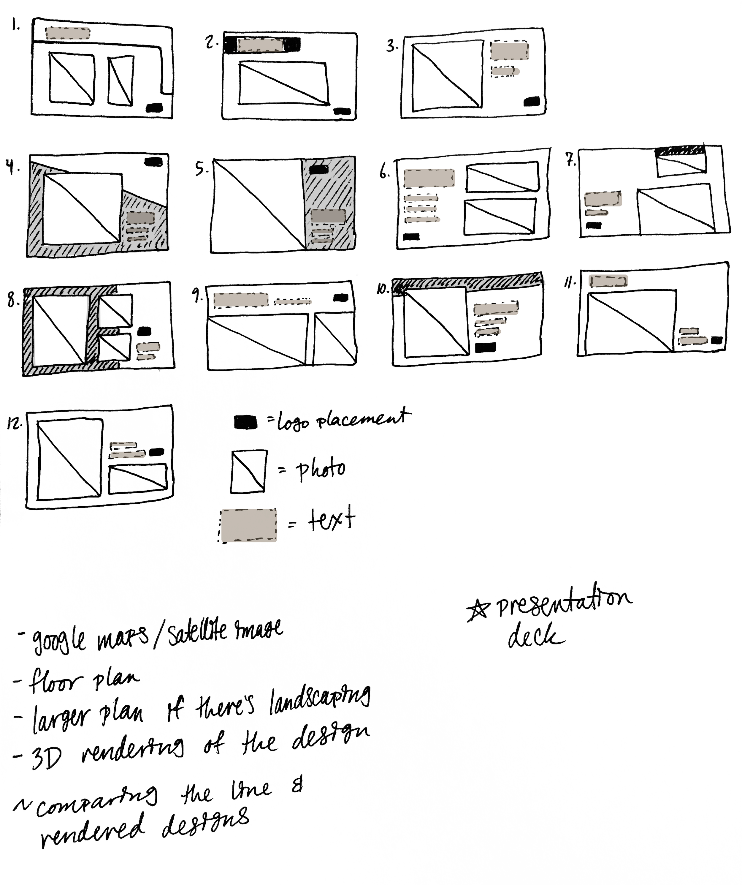
Went through multiple rounds of editing the logo, with three main versions. Using simple lines and shapes to get more complex ideas across in an easy way. Strongly influenced by sustainability and nature, which impacted the materials used for the stationery and the way that photography was used. At-home printing taken into account in the stationery for items such as the letterhead, to help save costs for the small business and using minimal ink.




PERSONAS
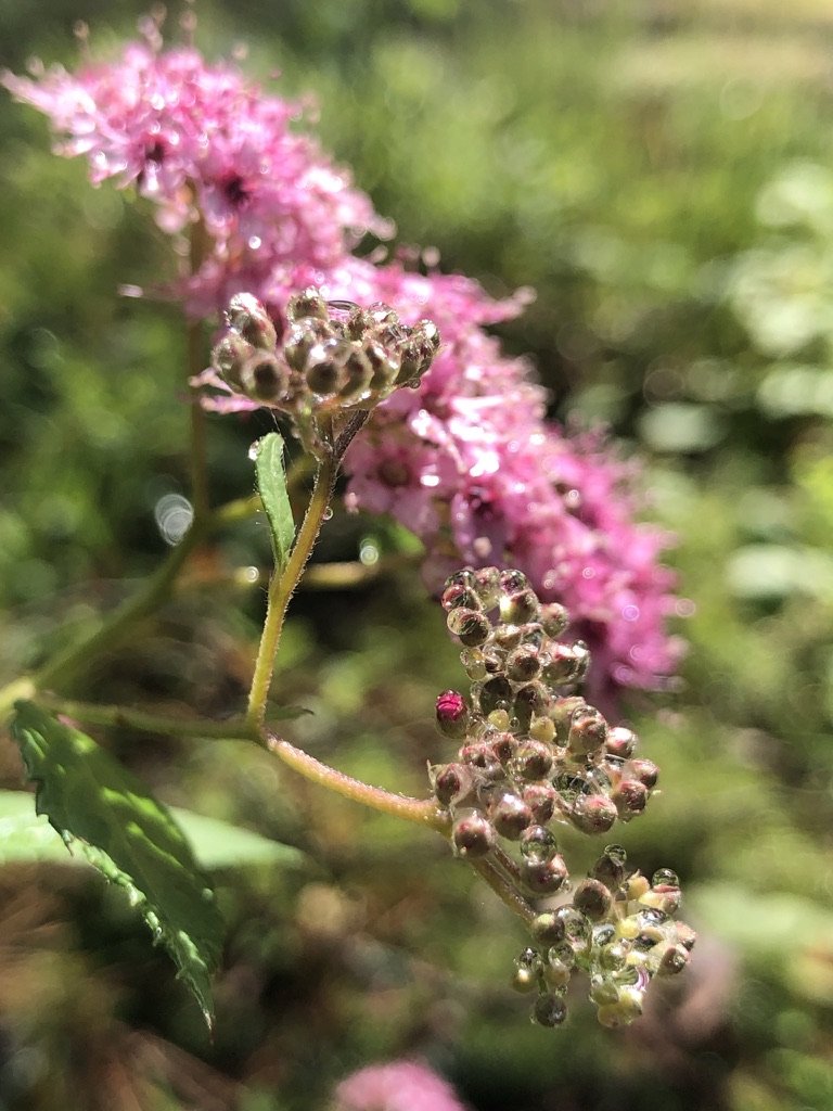
Adults living in the Bay Area who are interested in more sustainable and Nordic-influenced design. Specifically, those who are in search of landscape design, remodeling, or design for a new house.
Note: Persona photos are from Unsplash
Final Designs
Mockup photos are a mixture of my own, Freepik, and Unsplash
Google slides template for presenting the title and chapter titles, location of the project, floor plan, and 3D renderings with space for more text.


