BEARCONS,
BEARCONS,
2023
Adobe Illustrator, Microsoft PowerPoint
Color Palette
Primary (dark blue, green, & beige), Secondary (light green, grey, & white), Accent Colors (black & orange)
Font
Cormorant & Azo Sans
Icons
Lines (straight & wavy), rounded corners on rectangles
WHY BEARCONS?
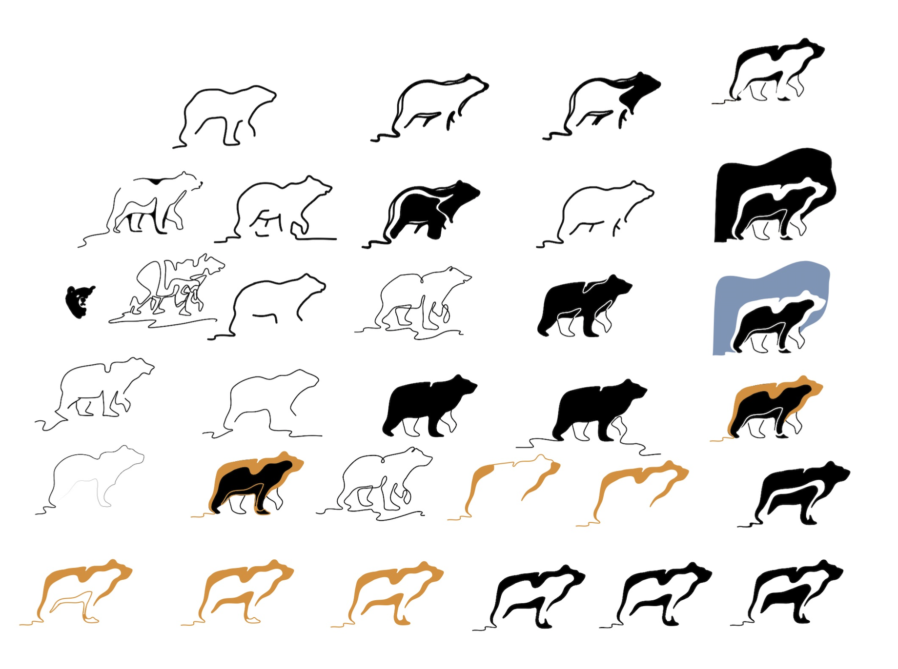
BearCons is a consulting company from Finland, which was in need of branding, including a logo. I designed the logo, chose the color palette, and chose the fonts. I also created the icons, a brand style guide, and templates for presentations and documents. The website is currently being designed.
Inspiration
& Process
INSPIRATION
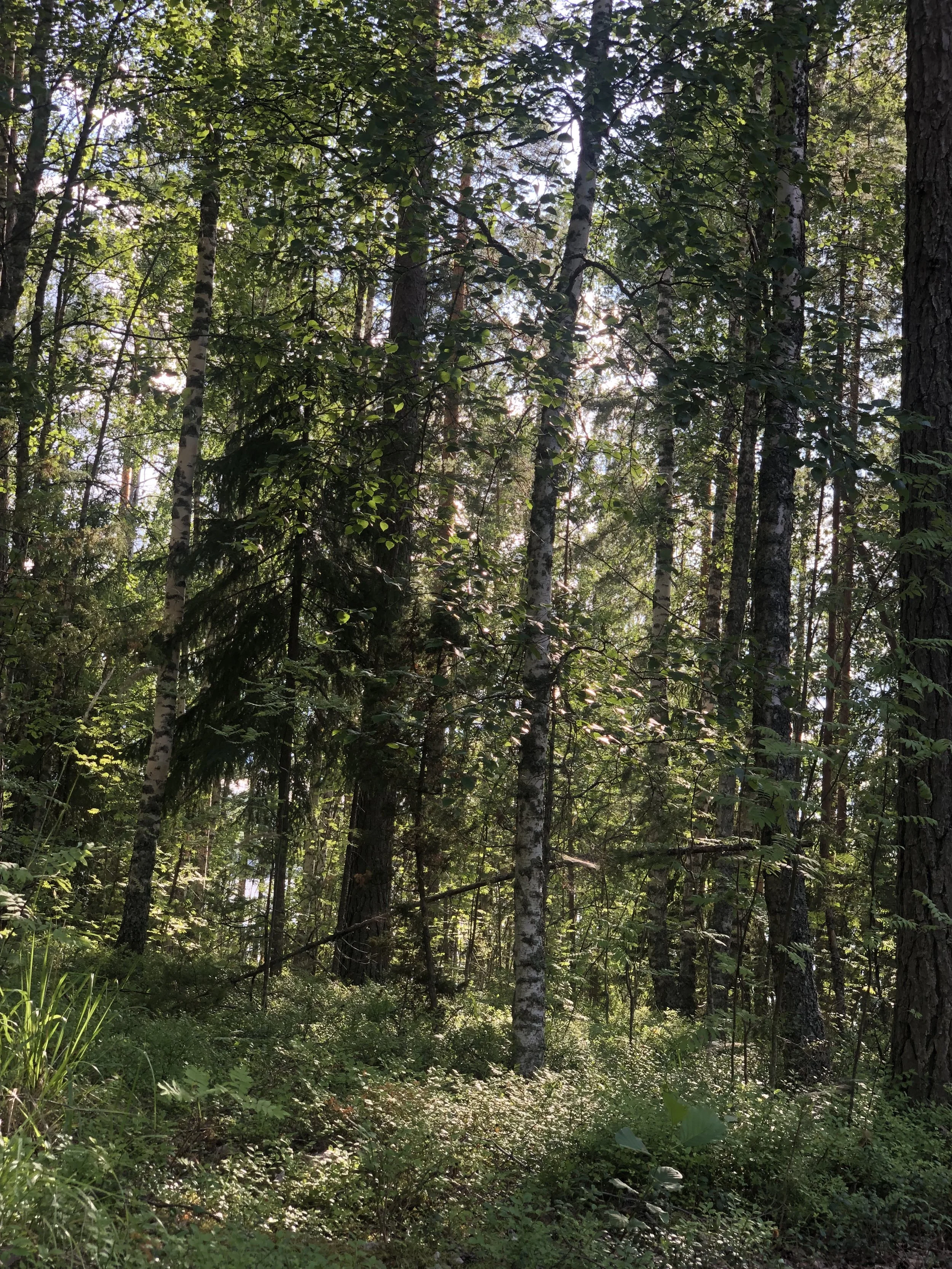
The look and feel of the branding is meant to be trustworthy, professional, and approachable. They wanted the logo to be a bear, in an illustration style that I generally work in. The color palette, logo, and icons were all inspired by Finnish nature throughout the seasons.
PROCESS
I presented three different logo designs, all in different directions but connected by a line element. The first one was a filled in design, with a bear head that was abstractly made up of the B and C from BearCons. The second one was a bear silhouette with varying weights. The third one was a bear silhouette made up of a continuous line and forming the ground below it. The client was most drawn to the third design, which then became the final logo design. The final logo’s ground line inspired the icon elements and slides, tying in that aspect in interesting ways, including varying opacities.


