DASH HACK 2023 & REBRAND,
DASH HACK 2023 & REBRAND,
2023
Adobe Illustrator, Adobe Photoshop, Adobe InDesign

-
Color palette/font/icons
About
What is Dash?
Why a rebrand?
Team
Timeline
-
Logo info
Sketches
Typography
Final logo
Dash rebrand workshop
Why, how, & key findings
Visual identity
Moodboards
Website redesign
Moodboards & wireframes
-
Final versions of:
Rebrand:
Logo
Website
Designs for Events Prior to Dash Hack:
Summer Party 2023 poster
Designs for Dash Hack 2023:
Design Thinking Guidebook (handed to all participants)
Name tags
Map
Directory signs
Stair stickers
Merch
Bingo cards
Certificates
Color Palette
Color Dash Purple, Electric Eel, Mint Chocolate No Chip, Papaya, Liquorice, & New Beginning
Font
Poppins
Icons
Dash bits (Dibits), lines, arrows
WHAT IS DASH?
Dash Hack is Europe's leading multidisciplinary problem-solving competition. In 2023, it was held from October 13th - 15th at Valo Hotel in Helsinki, Finland. It brings together 120 participants from different backgrounds and places them in teams of four to solve a challenge presented by a selected partner. In 2023 there were four partners: ABB, Sumitomo, Mitsubishi Logisnext Europe, and Mehiläinen. Dash Hack emphasizes the role of design thinking in bridging the gap between design, business, and tech.
WHY A REBRAND?
Dash, which was started in 2017, joined Startup Foundation in 2023. This change and fresh start meant wanting to translate that shift in the visuals of Dash as well. As the Visuals/Marketing team, we created a new logo, new visual identity, new assets, and new direction for Dash.
TEAM:
CMO: Ignacio Guerrero
Head of Visuals: Patricia (Patu) Sarkkinen
Lead Content Creator: Veera Ihalainen
Lead Graphic Designer: Ada Pärnänen
Photos: Daniel Almi
Process
LOGO
When creating a new direction for the Dash logo, we were told to make something that would:
be easier to use (not a diagonal logo since it can be difficult to center and utilize)
look more like pieces coming together rather than breaking apart
be playful yet professional
be used for many years to come
be different enough from the original logo but not too different
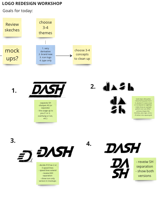
These were the main points to keep in mind at the start of our logo ideation process, as well as throughout. As the visuals team, we came together and shared our sketches during a workshop. Since we wanted some variety in the logo options, we narrowed down our logos to four main choices, which we then refined.
Our four categories were:
Similar to the original (a safer bet)
Brand new (a wildcard)
Icon logo (logo in which the letter D could be used on its own too)
Type only
After refining the logos, we placed them in mockups (on t-shirts, stationery, light boxes, and window stickers) to see how each of the four logos worked in different settings and scales. We noticed in the mockups that the wildcard option stood out the most, and that it was a risk worth taking.
The chosen logo was created and refined by Patricia Sarkkinen (Head of Visuals).
SKETCHES
All of our sketches together, and then the four chosen logos.
TYPOGRAPHY
The original typography for Dash was Raleway, and as we updated the logo we also decided to update the typography. We tested out a variety of fonts, both serif and sand serif, to see what would fit best with the new logo and with the test "Dash Hack 2023". We wanted a font that would be playful yet professional, friendly, legible, and include a large variety of weights. For all of these reasons, we landed on Poppins.
FINAL LOGO
Refined final logo in horizontal and square lockups.
DASH REBRAND WORKSHOP
After we revealed the new logo to the rest of the key volunteers at Dash, we held a workshop. Patricia and I held the workshop, while six volunteers attended. In order to get a variety of answers, the volunteers were from different teams within Dash and also included some who had been part of Dash for multiple years and others who were volunteering for the first time.
We received input from some of the key volunteers and board members at Dash during the logo redesign process. However, we still wanted to understand how the rebranding of the Dash logo was being perceived by more volunteers and also how we could unify the future vision of Dash.
In order to do this, we set up a workshop that had four specific focuses, exercises, reasons, and questions that the exercise results would address. We ended up splitting the workshop into two parts, with two exercises to start, then a 15-minute break, and then two exercises to end with, and a final debrief for any questions or comments that were missed.
The workshop resulted in a clearer focus for all participants, as well as the visuals team, since we all came to an agreement on key missions, words, values, and directions that describe the future of Dash.
KEY FINDINGS
Here are some of the key findings from two of the exercises, showing how participants viewed or wanted to view Dash. Each exercise was followed by group discussions in which each participant could elaborate on why they chose or did not choose certain wording (this is especially important because the same words could have different connotations for individuals based on past experiences and backgrounds).
My four initial moodboards.
Above is my moodboard after combining our favorite elements. What stood out to us the most were the gradients, bold colors, and experimental yet clean design styles. Although we were initially drawn to the black backgrounds and stronger contrast with that, we decided to go with lighter backgrounds for the majority of our designs, so that they would be more different than the original design style of Dash.
Above is the final color palette that we chose. The specific shade fo purple has always been Dash's main color, so we kept that shade of purple and built our color palette around that.
VISUAL IDENTITY
After and throughout the logo redesign, new font selection, and rebrand workshop, we thought about the rest of the new visual identity. After doing research, Patu and I individually created moodboards. During a separate workshop, the two of us looked for common elements (within those moodboards) that we were both drawn to and that would fit the new direction for Dash.
What we were aiming to include in our moodboards:
color palettes
fonts / typography use
overlays
main shapes
overall style / feel / tone
photography style
layouts
key elements
inspiration for our print and digital materials
WEBSITE REDESIGN
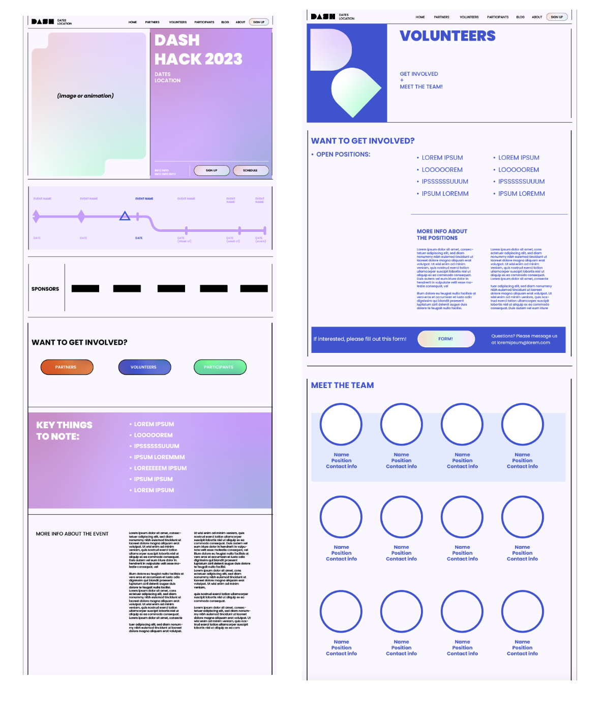
Building off of the visual identity workshop, we used those key elements, along with new moodboards that were specifically focused on web design, to create the website. Patu, Ignacio, and I created wireframes, chose a template, customized the pages, and finalized the designs in Webflow.
MOODBOARDS & WIREFRAMES
The main elements that we wanted to include in the website were:
gradients
rounded shapes
lines
fun color combinations

Final Designs
Photo: Ella Kaidesoja
LOGO & WEBSITE
Final logo design by Patu.
I added the gradient to the background.
Website: https://www.dash.design/
SUMMER PARTY 2023
Summer Party timeline posters that fit with the floral theme of the event. The timeline was meant to show key information about Dash over the years, in a fun and inviting way, and was displayed as two A3 posters at the event.
The birds and flowers were designed by Patu. I created the layout, vine leaves, bees, dotted pathways, and flower patterns.

Photo: Javier Hernandez
GUIDEBOOK
Dash collaborates with IDBM (International Design Business Management - a Master's program at Aalto) each year, as IDBM students are the mentors during the Dash Hack weekend. To help participants throughout the process, we created a guidebook. The guidebooks were printed for each participant and were also available online (with interactive links).
The text was written by IDBM students and alumni.
I designed the booklet, and it was reviewed by Patu.
The cover is located above on the left. The rest of the booklet is above on the right. Feel free to flip through the booklet above to see how I combined Dash and IDBM's styles together!
Photos: Maaz (left), Ella Kaidesoja (right)
Above: Inspiration for the booklet designs, along with an example of my completed designs.
NAME TAGS
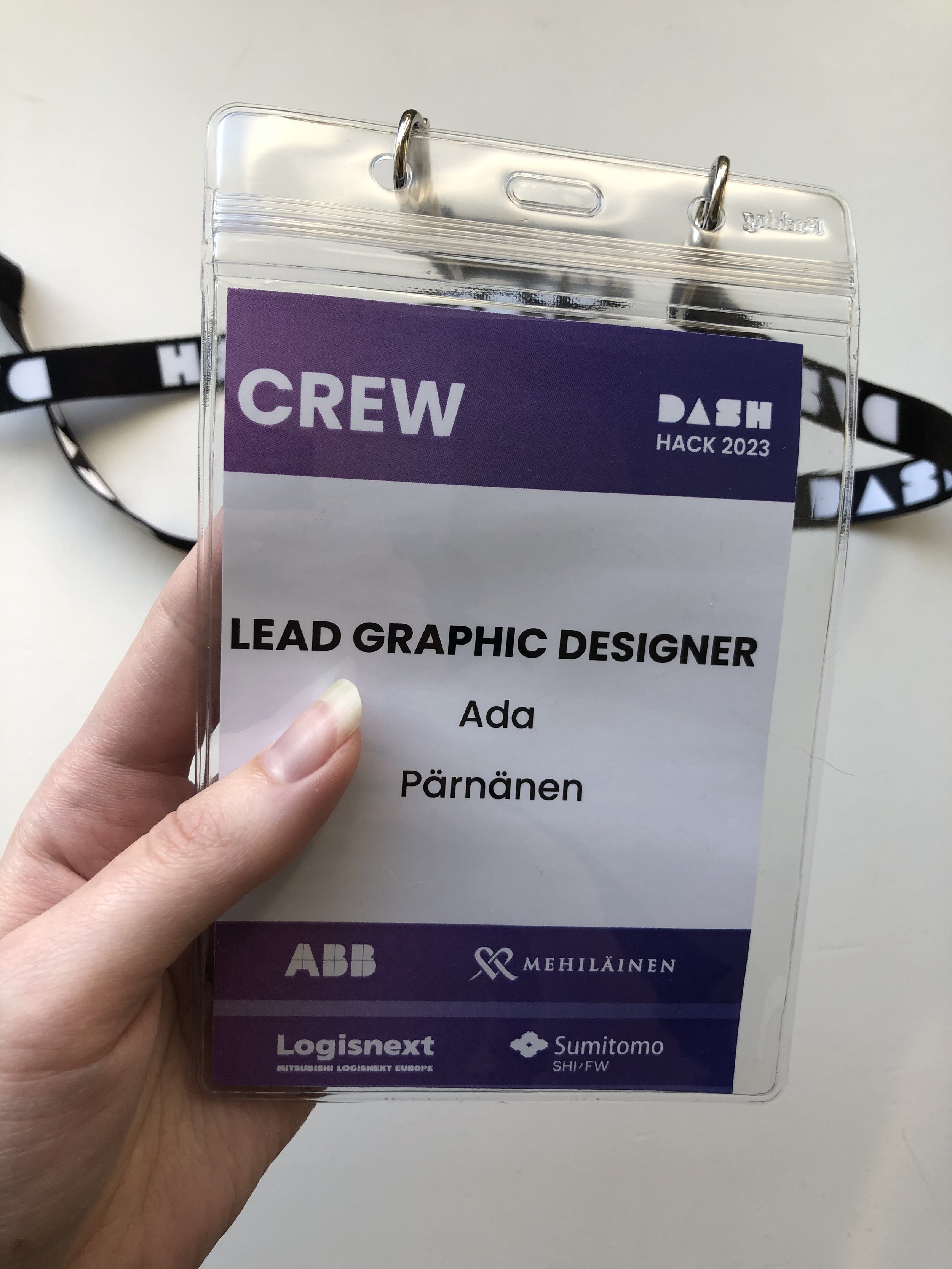
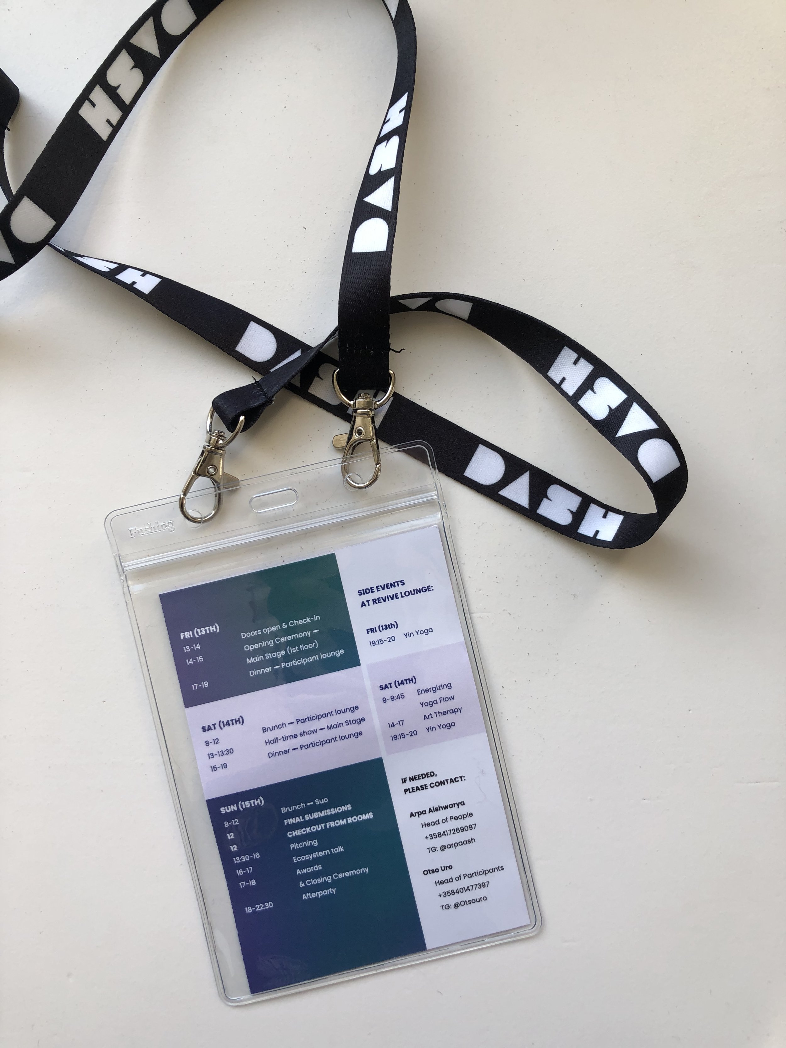
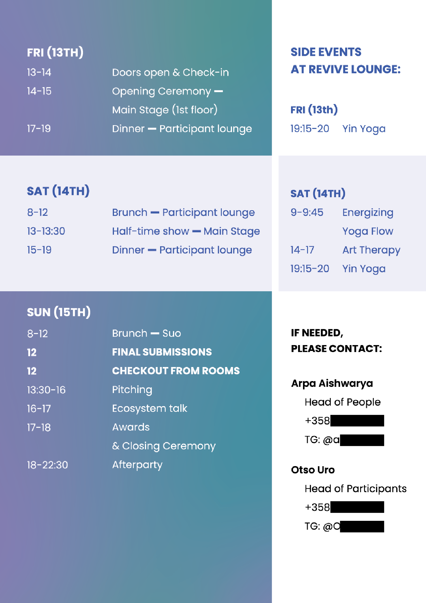
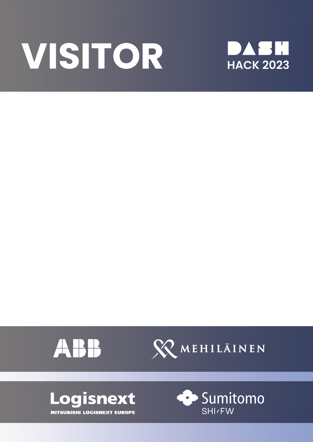
I designed name tags for the crew, partners, participants, IDBM mentors, and visitors, along with the schedules behind each name tag.
MAP
The base of the map was started by Dash's interior architect, Miriam Pfeiffer, and then I worked on the rest of the map.
Base of the map: Miriam Pfeiffer (left),
Final version of the map: my design (middle & right)
Photo: Eemeli Fills
DIRECTORY SIGNS
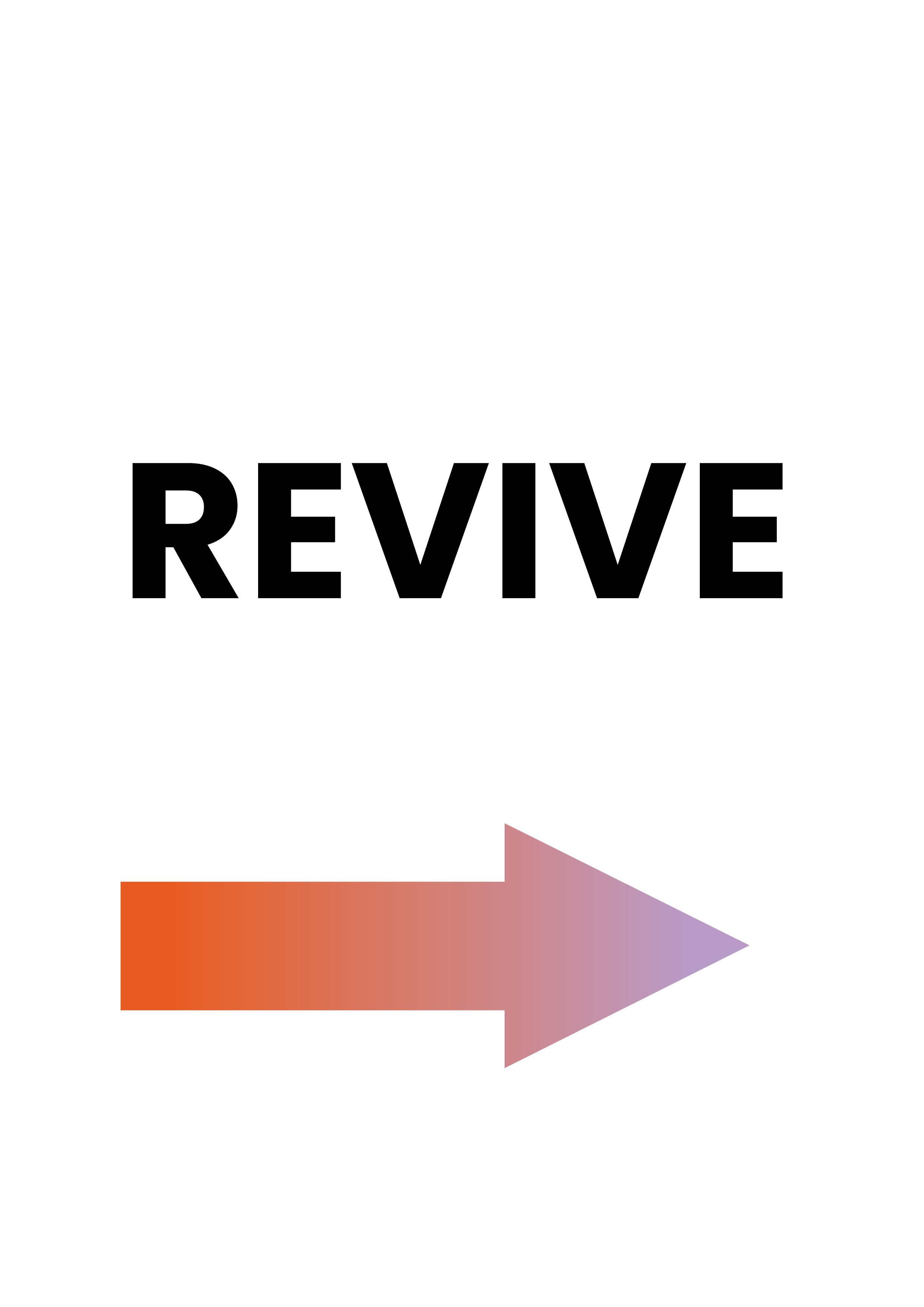
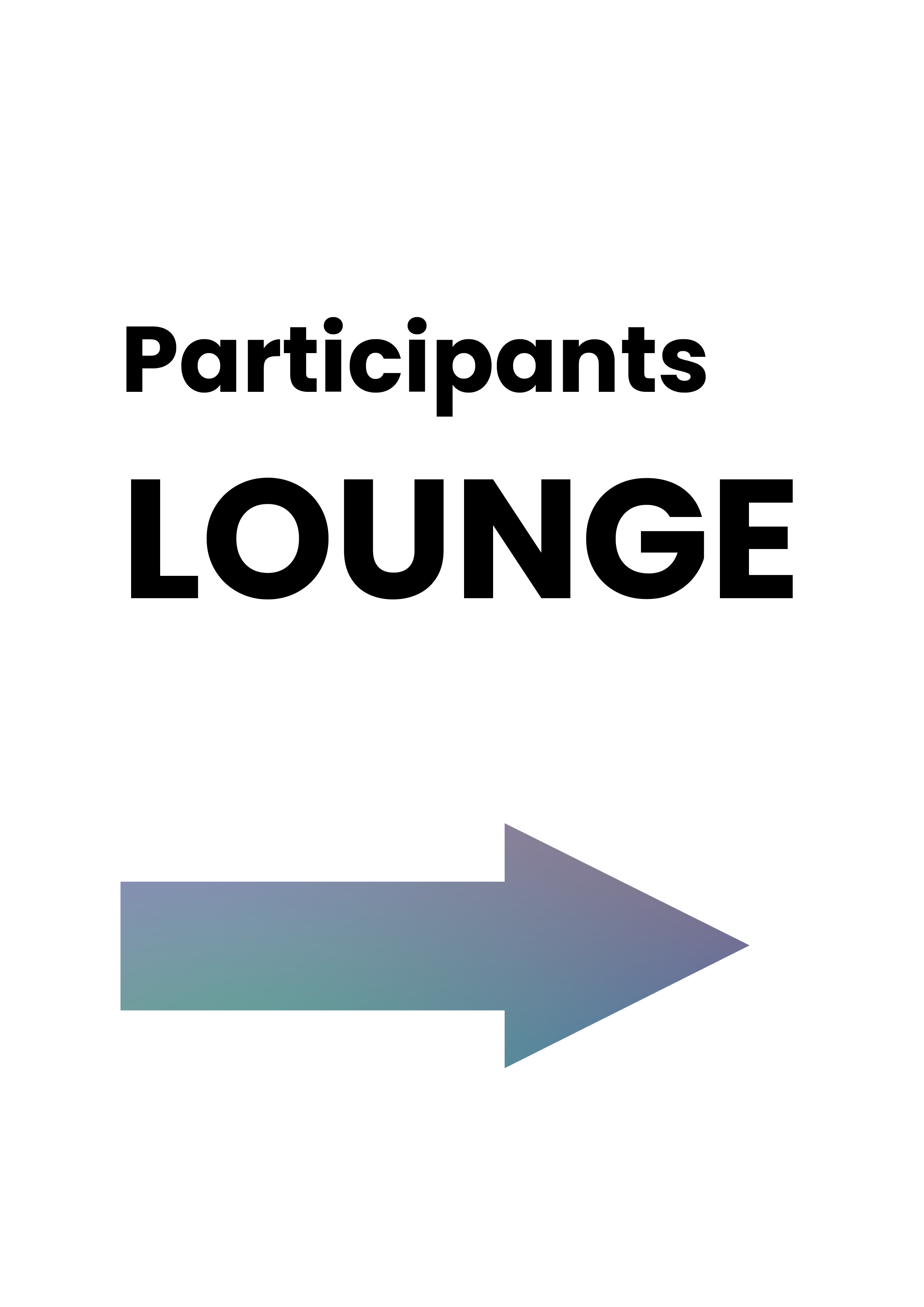
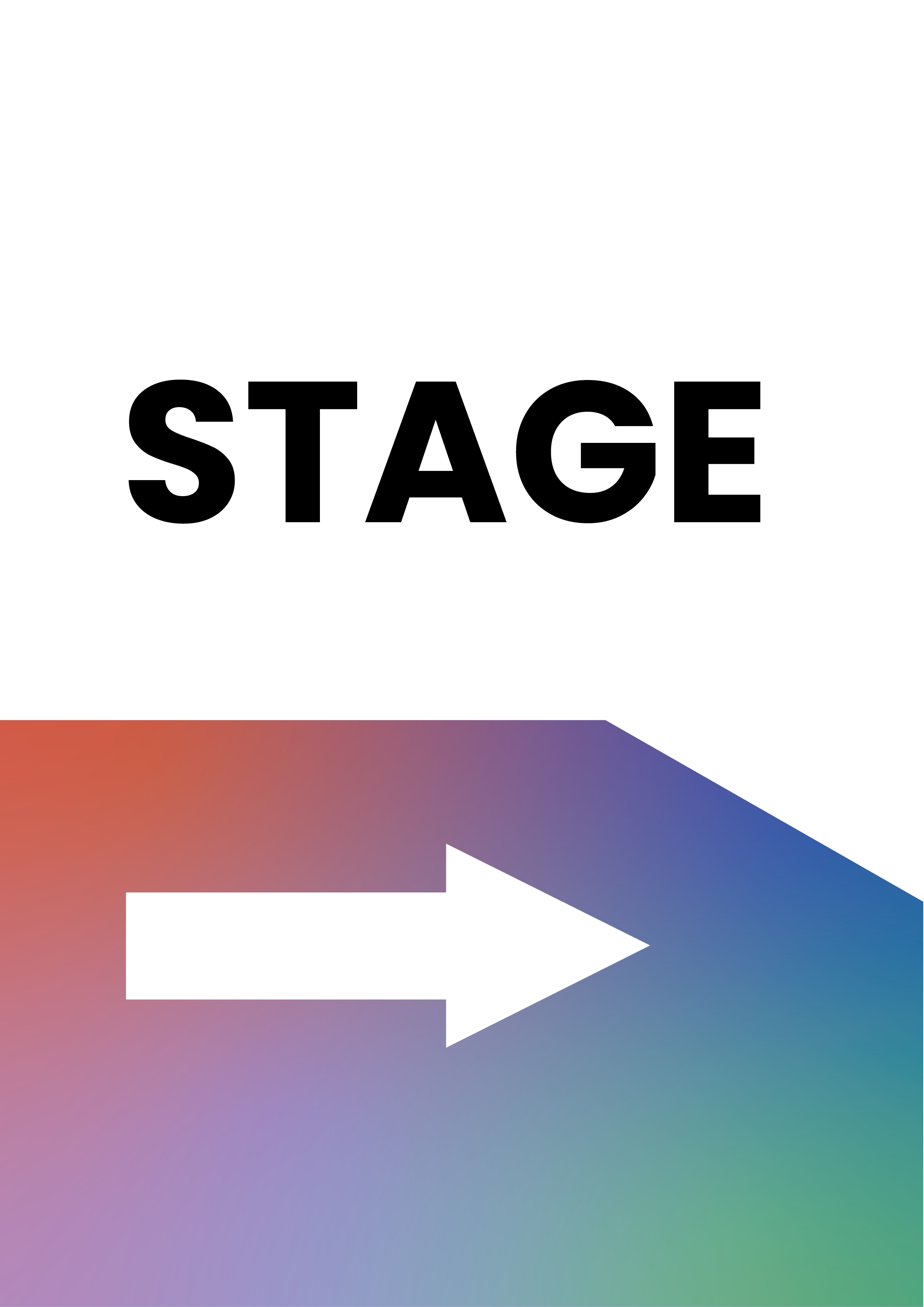
I designed directory signs that would help quickly guide people through the space. The signs were printed with arrows in both directions and placed throughout Valo. Below are the signs pointing in the same direction.
VINYL STICKERS
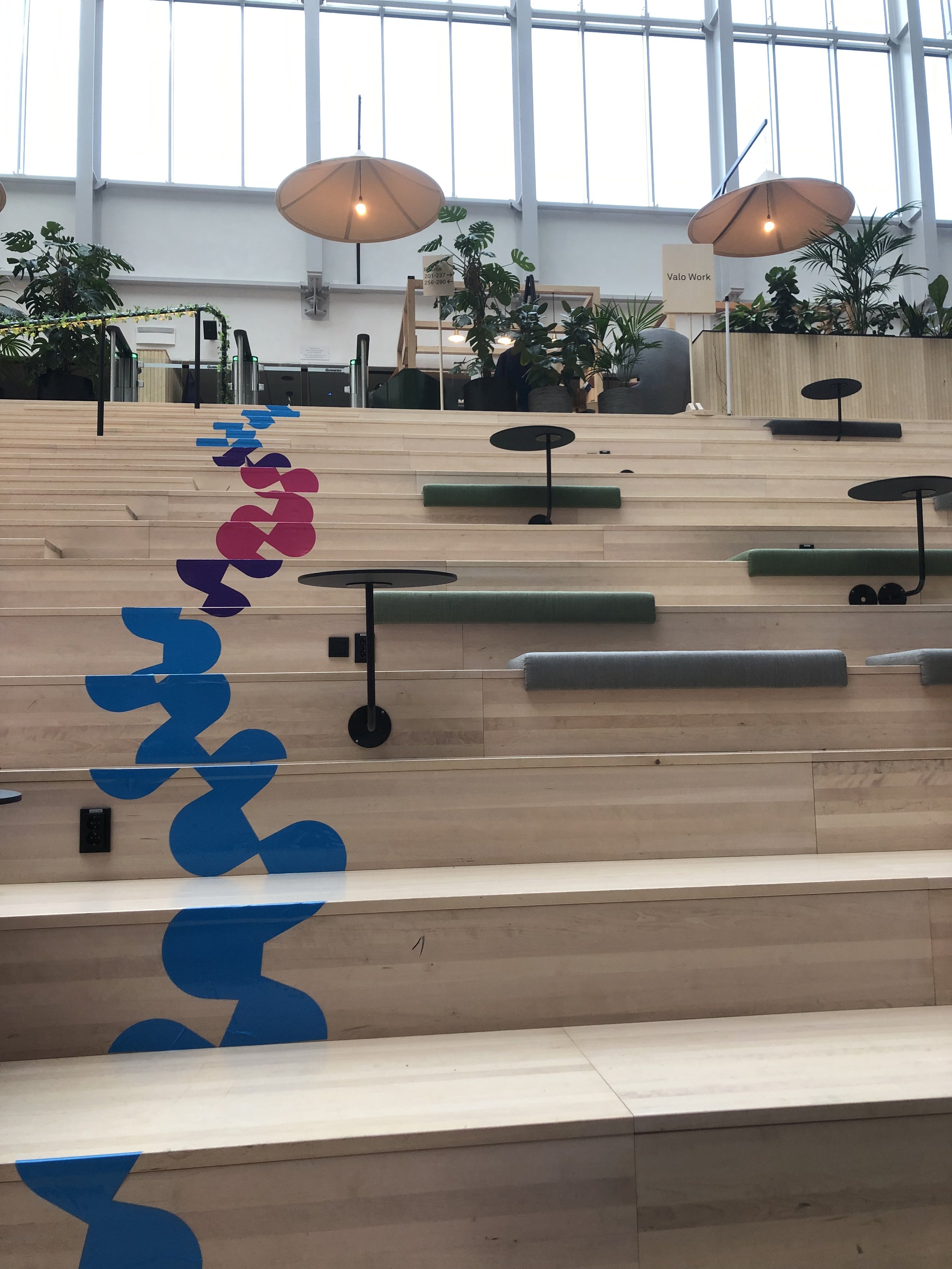
Dash's interior architect, Miriam Pfeiffer, had the idea of placing stickers on the main stairs at Valo, and I then designed them.
There were two sets of stickers for the stairs, one that was more curvy and one that was more straight. The stickers were cut with a vinyl cutter.
Photo: Yen Pham
Photo: Eemeli Fills
Photos (Set of three): Ella Kaidesoja
Photo: Eemeli Fills
MERCH
I designed the hoodies, tote bags, beanies, and socks. Patu designed the t-shirts (the ones for participants and the ones for volunteers) and patches.
We wanted to make the merch fun, interesting, and align with Dash's new branding.
Patu had designed each letter in the Dash logo to line up perfectly in a grid so that they could then be combined in fun ways in various assets. Inspired by this, I decided to create patterns with the letter D from Dash, which resulted in the curvy shapes on the stairs, the straight line on the booklet, and the shapes on the hoodies, tote bags, and socks. They also related to the theme of Dash Hack 2023, which was Level Up, resembling an abstracted ladder to level up and step up to the challenge. The curving lines are also related to the fun atmosphere of Dash, and the way that Dash Hack is always embracing the non-linear hacking process.
Photos (Set of two): Ella Kaidesoja
Photo: Javier Hernandez (Below)


Photo: Maaz

Photo: Ella Kaidesoja

Photo: Yen Pham

Photo: Ella Kaidesoja
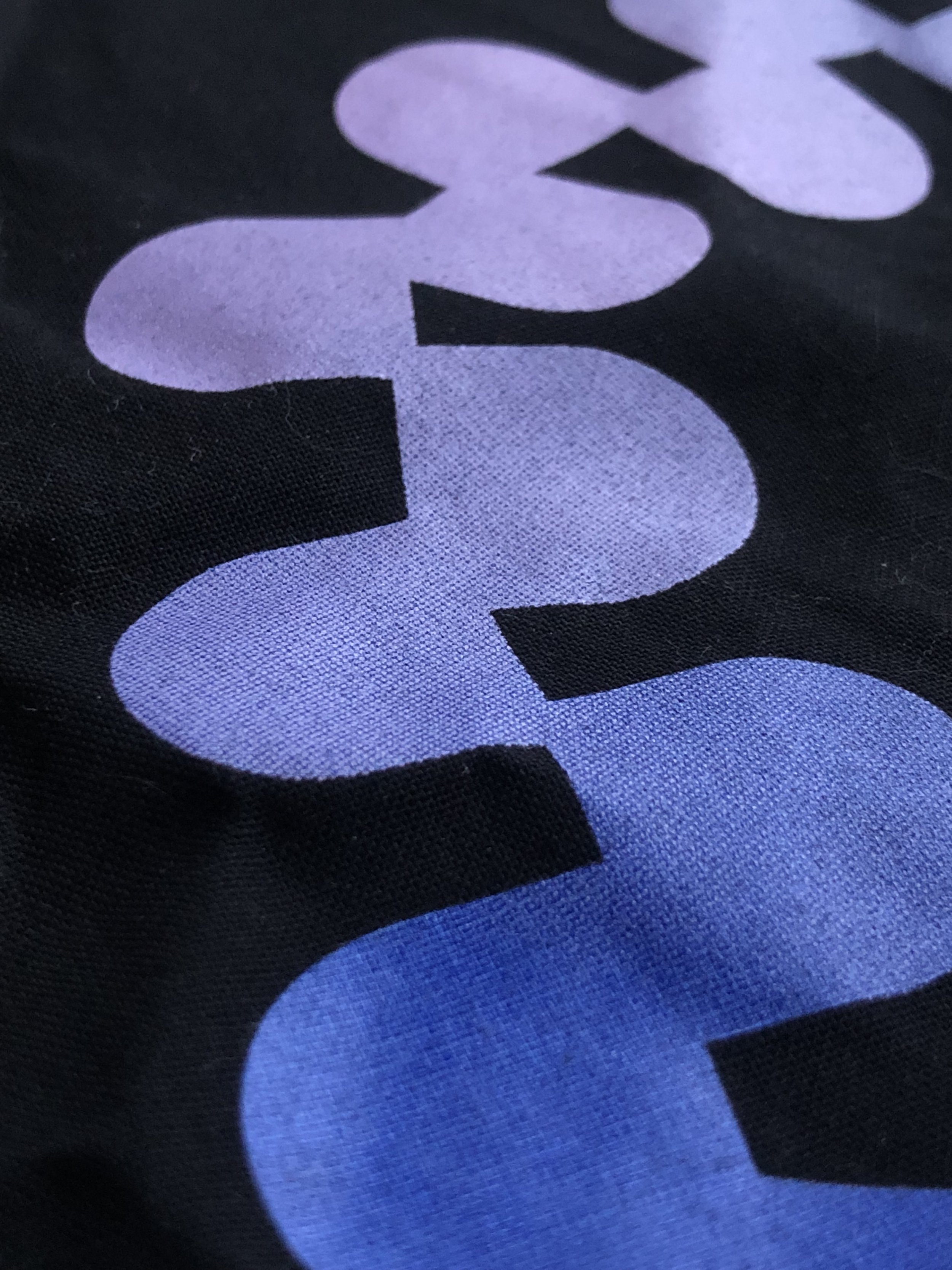
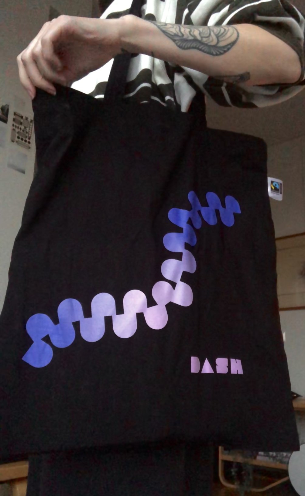

Photo: Eemeli Fills

Photo: Ella Kaidesoja
Photo: Ella Kaidesoja
BINGO CARDS
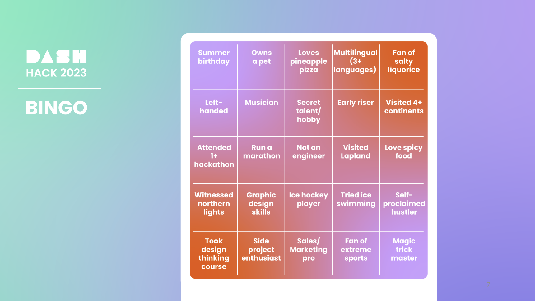
Iiris Nuutinen (Side Event Group Lead), Hyunkyung Choo (Head of Program), and their team members created the text for bingo, which was played by participants during the half-time show.
I then designed the slide that was presented during the bingo game on the large screen, along with designing the printed bingo cards.

Photo: Ella Kaidesoja

Photo: Ella Kaidesoja


Photo: Eemeli Fills
CERTIFICATES
Each participant received a certificate of completion at the end of the Dash Hack weekend. Patu and I designed the certificates together.
Here is an example of the certificates, but with placeholder text, along with the partner logo dotted over, for privacy reasons.
A special thank you to ALL of the volunteers, participants, and partners, who helped make Dash Hack 2023 a success!
Photos: Maaz (top right) & Eemeli Fills (bottom right)
Photo: Javier Hernandez (below)


