SADNECESSARY,
SADNECESSARY,
2024
Adobe Illustrator, Adobe Photoshop, Adobe Premiere


Color Palette
Red, orange, & blue
Font
Hand-drawn custom font & Baskerville
Icons
Abstract organic shapes
WHY A 10-YEAR ALBUM?
Around 10 years ago, Milky Chance released their debut studio album titled Sadnecessary (October 2013 in Germany, and October 2014 in the U.S.). The genre of the album is Folktronica.
Milky Chance has gained global success over the years, so this redesign of their debut album is a way of remembering where they started, while also looking to the future.
INSPIRATION
Please note that this was not an actual client project for Milky Chance. This was a creative exercise, where I chose an artist that I enjoy listening to, and imagined what different assets for the 10-year album and tour could look like.
The original Sadnecessary album cover had a red paint splatter, against a green and blue background. The cover also had a delicate white font. In more recent years, their album and single releases have included more organic shapes and, trippy patterns, and bolder fonts. For my redesign, I wanted to combine these ideas.


PROCESS
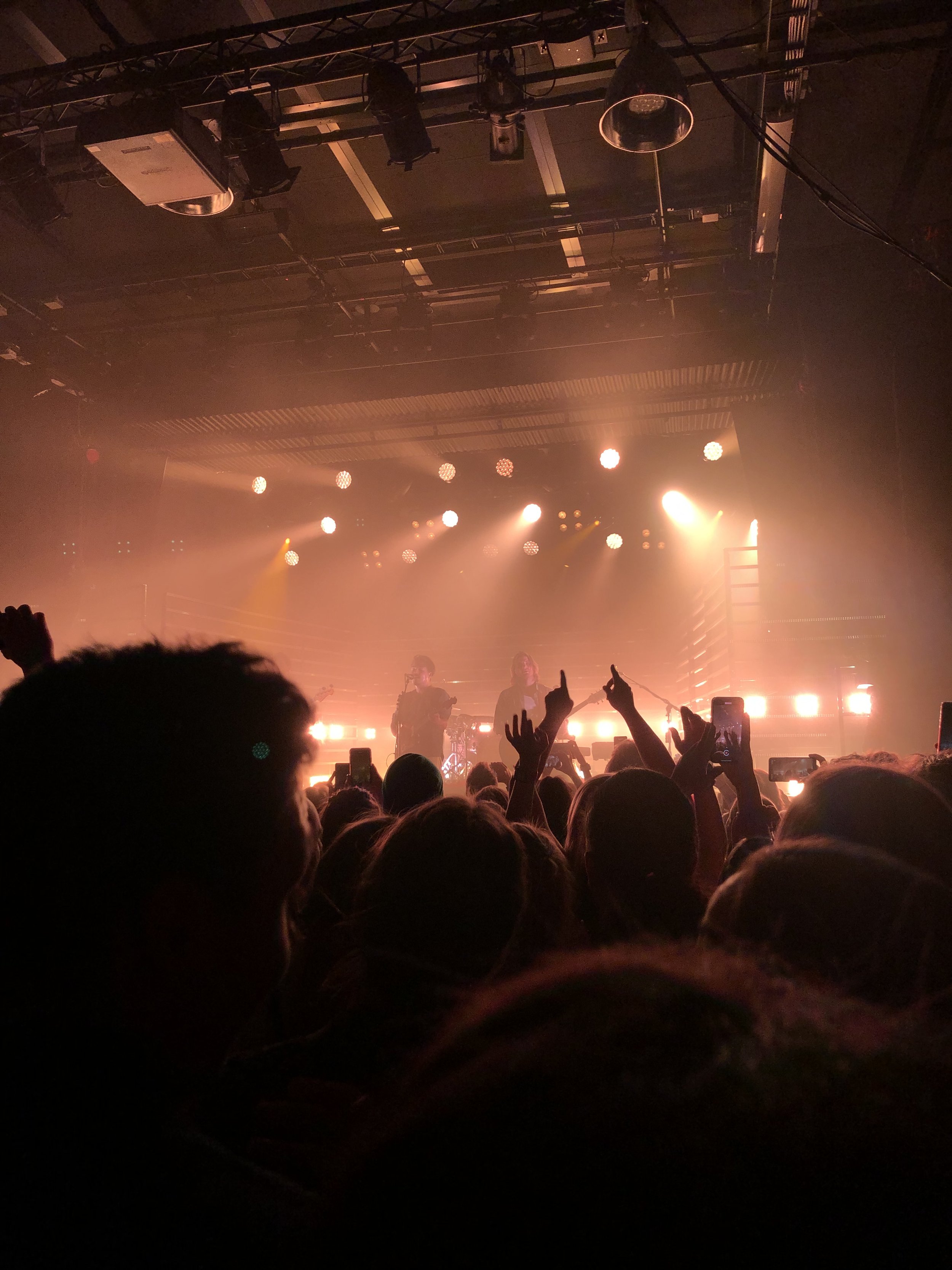
For the color palette, I wanted to bring in a similar contrast as the original red against green and blue, but instead use orange against blue and black. Milky Chance utilizes lights in an interesting and fun way at their shows, so the black and blue bring in more of an evening show feel to the cover.
The background has black and a dark grey, so that the grey can be transparent in various scenarios, allowing for photos or videos to show through.
The custom font takes aspects of the synchronize font but softens it up to fit the style of the songs on the Sadnecessary album. The title is made to flow with the pattern in the design. The custom font is contrasted with the serif font, Baskerville, but in a way that still flows, with the varying line weights around them.


Final Designs
RECORD COVER
For the 10-year reissue of Sadnecessary.

Mockup photo: Jonas Leupe (Unsplash)
Photo editing: Myself

Mockup photo: Pawel Czerwinski (Unsplash)
Photo editing: Myself

Mockup photo: Bram Naus (Unsplash)
Photo of Milky Chance: original photographer unknown
Photo editing (of mockup & Milky Chance photos): Myself
Using videos that relate to the album design, in order to emphasize the design elements and add more movement. This could also be used as promotional material on social media, on tour, etc.

LECTURE EVENING POSTER
A poster design for a lecture evening (part of a lecture series where artists come speak to students) on a college campus, where they would talk about their journey making the album, their success and challenges since then, and what they hope for their future. There would be a Q&A section as well.
